


This worldview seems informed by the belief that any problem, no matter how complex or complicated, can be solved by crunching enough numbers. The problem is that when dealing with actual, living human beings, numbers don’t always–or ever–mean what we think they mean.
In honor of the NCAA Basketball Tournament, let’s look at an example from the world of sports. Let’s say we have two hypothetical college hoops teams, the “Reformers” and the “Defenders,” and both teams finish the season with identical records of 20-15. Based on their numerical records, the teams are equal, right?
Not quite. Because the Reformers play in the Big Corporate Conference, or BCC, which has been, historically, one of the most competitive in the country, while the Defenders compete in the Ivory Tower League, or ITL–an organization of universities that strongly values academics, teaching, and scholarship, and sees participation in athletics as just one part of their institutional mission (I know, I know–this kind of conference would never exist in real life–let me dream!). As a result, each of the Reformers‘ victories are given more relative weight, or value, in the complex statistical formula used by the national rankings experts, while the Defenders‘ victories are given less “credit”. So, even though both teams finished the regular season with the same record, the Reformers were ranked in the top 25 and awarded a 6 seed, while the Defenders finished the season unranked and missed the tournament. Sounds fair, right?
Well, not so fast my friend!
It just so happens that this was a “down year” for the BCC, and their advantage over other conferences in the seeding process is based more on historical precedent than current performance. At the same time, the ITL’s teams overachieved as a group, and their “mid major” league was actually the home of some of the country’s best teams this year.
This conflation didn’t seem to matter in the tournament seeding process, however, with the Reformers “earning” a solid ranking–based on the allegedly data-driven selection procedure*–and the Defenders being left out of “The Big Dance”. Some observers openly wondered if the presence of the BCC Commissioner as the chair of the Selection Committee might have been a factor in this predicament.
*A team’s strength of schedule is made up of 3 components.
The 3 components:
AdjEM is the overall strength of schedule of a team
AdjO – Opponent’s average adjusted offensive efficiency
AdjD – Opponent’s average adjusted defensive efficiency
AdjEM for strength of schedule is calculated:
AdjEM of SOS = AdjO – AdjD
But what does it matter? It’s just a game, right? Again, not so fast my friend…
By making the tournament the Reformers also receive a payment of $1 million from the lucrative TV contract their conference signed with the networks, while the Defenders miss out on any financial reward. And if the Reformers get hot and win a few games, their earnings keep increasing, which helps to fuel their recruiting efforts, and allows them to offer their coaches even higher, more attractive salaries–even as the Defenders continue trying to compete with fewer resources.
In other words, the rich get richer, while the poor get poorer. And all based on Big Data and metrics.
Now, how does all of this play out in the world of education reform?
Let’s say you have two schools in your community: the Reformer Charter Academy, and Neighborhood Public School.

The local newspaper publishes an annual “school ratings” feature, and new families moving into the area, encouraged by real estate agents, turn to these ratings when making decisions about where to purchase a home. The ratings are developed using a “Big Data” approach that incorporates multiple data points, including the state’s recently introduced, and heavily scrutinized, “A through F Ratings” system, average student scores on standardized tests like the ACT and SAT, and high school graduation rates. This data is then converted to a score on a 100 point scale for each school in the region. Sounds fair, right?
It might be if we were measuring widgets, or soybeans, or water quality. But we’re “measuring” students, teachers, and community members here, and the numbers don’t quite tell the whole story.
For example, applying “A-F” ratings to entire school districts, or even individual schools, is a stunningly clumsy way to characterize something as complicated and nuanced as a school. At any local public high school, for instance, you’re likely to find a rich and diverse array of AP classes designed for college-bound students, remedial classes, special education classes, music, art, and physical education offerings, and industrial arts classes. Trying to derive a single rating that describes this diversity of offerings is a fool’s errand, and bound for failure.
Charter schools, on the other hand, tend to focus on a more narrow view of schooling, and far fewer curricular choices for their students. While this approach may result in a better “A-F” rating, few observers would equate that rating to a better overall educational experience for students.
Charters are also well-known for the phenomenon known as “creaming,” a process by which school officials “target students who are mostly likely to succeed and cause minimal disruption or resource drain at the school.” It’s worth mentioning that these “creamed” students are being targeted and recruited from local public schools–siphoning away students who are more academically capable and less disruptive.
In other words, the rich get richer, while the poor get poorer. And all based on Big Data and metrics.
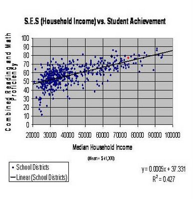
Underlying the Big Data approach is a myopic focus on standardized test scores as the sole measure of student learning. What this “data point” fails to take into account, however, is the clear relationship between parental income and student test scores. To put it bluntly, the more money one’s parents make, the higher the test score. We can see this relationship in numerous research studies and reports.
Here’s a graph showing the correlation between socioeconomic status and math and reading test scores:
And here is a table showing how “SAT scores go up in perfect tandem with $20,000-dollar family income amounts”:
Family Income Reading Mathematics
0$ – $20,000 433 461
$20,000 – $40,000 463 481
$40,000 – $60,000 485 500
$60,000 – $80,000 499 512
$80,000 – $100,000 511 525
$100,000 – $120,000 523 539
$120,000 – $140,000 527 543
$140,000 – $160,000 534 551
$160,000 – $200,000 540 557
More than $200,000 567 589
Are rich kids “smarter” than poor kids? Of course not. So what’s going on here, and what are these numbers really telling us?
For one thing, they are telling us that test scores are a pretty awful way to explain what kids know and can do. Test scores are nothing more than a crude metric that captures a single moment in time–and even then, not with much accuracy. Test scores are influenced by a myriad of factors, including test length and item difficulty, test question wording and terminology, student interest and relevance, and cultural biases. Some kids are good test takers; others are not. A student could wake up sick on the morning of “the big exam,” and not do so well; another kid can “guess right” and get a score that has little to do with their content knowledge.
Another thing these numbers “tell us” is that there are a lot of “out of school factors” that influence student learning that are not controlled for in a metric as simplistic as a raw score. Factors such as:
In fact, “nonschool factors account for over 60 percent of the variance in student achievement, with as little as 7.4 percent of this variation being attributable” to in-school factors, such as school and teacher quality.
So, to paraphrase the immortal words of Inigo Montoya, “You corporate education reformers keep using these numbers. I do not think they mean what you think they mean.”

