
Clear as mud
I was cleaning up my office today and came across a couple Public Act 4 repeal petitions. I thought it would be interesting to see how wrong the fonts are. Recall that Citizens for Fiscal Responsibility wants to toss out nearly a quarter million petition signatures because they say the heading font is smaller than the required 14-point boldface font (state regulation HERE (pdf).) They aren’t saying that the petition language itself is too small, just the heading.
Here’s the petition. The part we’re interested in is the bit that says “REFERENDUM OF LEGISLATION”.
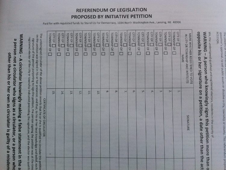
Click for a larger version
The next thing I did was to try to find a font in Microsoft Word that matched the font on the petition. The best I could come up with was Arial Narrow. I printed up the “REFERENDUM OF LEGISLATION” in 12-point and 14-point boldface font and then compared them.
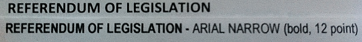
Here’s the 14-point font overlaid over the heading:

Click for a larger version
Now here’s the 12-point font overlaid over the heading:
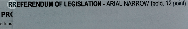
Click for a larger version
Hah! They ARE wrong! Right? Not by much, probably less than a millimeter but WRONG! Right?
Not so fast. Look at the width comparison of the 12-point font:
Click for a larger version
Hmmm…with kerning differences (distance between letters) and the differences in the font itself, the petition font actually seems quite a bit bigger than 12-point. Let’s look at the 14-point:

Click for a larger version
Well look at that. The petition heading is exactly the same width as the 14-point font.
What’s the point of all this? The point is that the differences in fonts are such that “14-point” font is a bit of a loose term. It depends on which font you use and on the kerning. At the end of the day, the difference in height between 12-point and 14-point bold Arial Narrow font is literally one millimeter or less.
This is what we’re talking about:

Is that enough to justify throwing out nearly a quarter million citizens’ petition signatures? Obviously not, particularly when (a) the printer has produced a printers’ affidavit swearing the font is the required size and, just as importantly, (b) there is precedent to NOT do that.
Did I mention that Citizens for Fiscal Responsibility submitted their challenge to the Board of State Canvassers less than an hour before the 5:00 p.m. deadline last Monday?
I said it before and I’ll say it again: desperate.
UPDATE: If you didn’t catch Rachel Maddow’s piece on this last Wednesday, do yourself the favor of watching it now:

